Introduction
Sometimes it is desirable to alter the contrast of an image, either to darken faint text or to lighten a dark background, and increase the readability of the data on the image. ScanFix Xpress provides functionality to analyze an image, to determine the degree of contrast, and two methods for increasing the contrast of the image. This functionality works on gray and color images only.
Contrast Analysis
The analysis phase of contrast correction takes place during the initialization phase. In analysis, the image is sampled along a grid whose spacing is calculated using the quality setting. Higher qualities examine more samples, lower qualities examine fewer samples. The samples are used to generate a histogram of the brightness of the image at various locations on the image (the higher the quality, the more locations) and estimate brightness, contrast, noise, and variance in the image.
The background brightness is calculated by looking at the median brightness (which is a more accurate measure for this purpose than the average) at regions across the image, and calculating the average of those medians. The top percent of brightest and darkest pixels are also calculated, and used to determine the amount of noise and contrast. Since the algorithm assumes dark text on a light background, the range above the median is used to estimate the noise radius, and the range below the median is used to estimate the contrast. The difference in the median values between different regions of the image is used to detect a varying background color, and may affect the correction method chosen. If the measured contrast is lower than the noise radius, the image will be reported as uncorrectable. The algorithm described here assumes document images consisting of dark text on a light colored background. If the image consists of light text on a dark background, the image may be processed inverted (see detect negative for information on automatically detecting light-on-dark images).
Contrast Correction
Contrast correction parameters are based on percentile brightness, so a basic understanding of what the percentile brightness represents is important to allow a proper choice of minimum and maximum values. Percentile brightness is based on a percentage, so values of 0 to 100 cover the range of brightness in the image. The Nth percentile brightness specifies a brightness brighter than N percent of the pixels in the image, and darker than (100 – N) percent of the pixels. For example, the 90th percentile brightness would represent a brightness where 90% of the sampled image pixels are darker, and 10% of the sampled pixels are brighter. The 50th percentile, where half the pixels are brighter and half are darker, is the same as the median value, and is a good estimate for the typical background brightness. The 0th percentile value will be the brightness of the darkest pixel sampled, while the 100th percentile value will be the brightness of the brightest pixel sampled. Values of -1 and 101 can also be provided for percentiles; these values DO NOT change based on the samples, but are fixed at a brightness of 0 and 255 respectively, representing the darkest and lightest possible brightness. These values are used to force the contrast correction to shift the image brightness in only one direction, as will be explained below.
Contrast correction works by taking two brightness levels, specified by minimum and maximum percentiles, and maximizing the contrast between those levels. This is done by moving all pixels darker than the minimum percentile to a brightness of 0, and all pixels brighter than the maximum percentile to a brightness of 255. Values in between the minimum and maximum will be proportionately distributed in the range of 0 to 255. For example, setting the minimum to the 0th percentile and the maximum to the 100th percentile will take the darkest pixel sampled and drop it and any darker pixels to a brightness of 0, and will take the brightest pixel sample and raise it and all brighter pixels to a brightness of 255. Since the percentile brightness is based in the image content, very dark images will be brightened, and washed out images will be darkened, whichever is needed to maximize the desired percentile range. See the section below for tips on choosing the right percentiles for your documents.
Adaptive vs. Global Correction
Global correction is the method that will most often apply to document images. In global correction, the minimum and maximum percentile will be chosen based on the average percentiles for the entire image, and the same brightness remapping will be applied to the entire image. This is the best approach to use for images where the background variance is low, because it is faster and easier to use.
Where background variance is high, such as images with varying background brightness, then using the same brightness values for the contrast enhancement may not work on all regions. In this case, the adaptive correction is the solution. The adaptive correction looks only at the contrast in the regions adjacent to each pixel, and chooses the brightness values based on that data. This means that the 50th percentile in one region of the image might correspond to a brightness of 240, while in another region with a shaded background, the 50th percentile might correspond to a brightness of 170. The quality factor chosen determines how big the regions are; a low quality will divide the image into only a few regions, while a high quality factor will divide the image into many regions. Higher qualities make the algorithm more responsive, so that it will adapt to changes in the background in a very short distance, while lower qualities result in changes over a larger distance.
The adaptive correction, especially at high quality levels, will very aggressively enhance the contrast—for example, in some cases it is capable of extracting faint text bleed-through from the back of documents; it is capable of expanding a difference in brightness of only a few percent to fill the entire range of brightness. This can be useful if it is applied to carbon copies where the data is very faint, but can be undesirable if it is magnifying a section where there is no desirable data. The aggressiveness of adaptive correction is controlled by the contrast limit parameters. The contrast limit determines how much the brightness of a pixel can be changed; a limit of 0 means that the brightness of the pixel will not be changed at all, while a limit of 255 means that any contrast at all can be expanded to the full range, pulling out even the faintest data. The contrast limit is set by three parameters, corresponding to high, medium, and low brightness values. For example, high contrast limit on bright pixels and a low limit on medium and dark pixels will allow light gray text to be darkened, but will prevent dark gray dot shading from becoming brighter.
Choosing the Right Percentiles
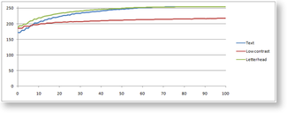
Ideally, all text in a scanned image would be pure black, and the background color would be a pure, bright color, but that is rarely the case. Inks reflect some light, while the paper absorbs some, the textures create inconsistencies in the brightness levels, and compression artifacts add additional noise. The following image shows a highly magnified section of very clear scan of black text on a white background, saved as a high quality JPEG image:

Note the specks in the background, caused in this case primarily by compression artifacts, as well as the highly variable brightness of the “black” pixels. Add to this the fact that the percentile brightness will vary based on the amount of text in a given region, and the result is a percentile graph that is probably not as straightforward as one would expect. The analysis portion of the contrast correction will return a percentile graph, and it can be very instructive to plot that graph for problem images, to get an understanding of how the brightness changes as a function of the percentile, so that an intelligent choice can be made. This section will look at three different document images and compare the percentile graphs to demonstrate what happens when these images are processed.
The image on the left is a clean, bright image containing only black text on a white background; this is the same image from which the “invention” image above was taken. The next image is a gray scan of an image printed with colored ink on colored paper, which yields a low contrast image. The last is the same scan as the first, but with margins and colored letterhead left in place.
The text and letterhead images follow a very similar curve, but the margins in the letterhead image pushes up the brightness, especially at lower percentiles, due to the lower ratio of dark to light pixels. This means it’s important to err on the low side when picking a percentile to represent the text; even the 0th percentile values are very bright, representing the lightest pixels in the text.
The low contrast image has a similar shape as well, but with much less change from the 0th to 100th percentile. This shows how the use of percentile brightness is relatively insensitive to changes in background and text color, because the same set of carefully chosen percentiles applied to all of these images will result in good output. This also illustrates the values chosen for noise and contrast in the analysis phase; contrast (difference between 1st and 50th percentile) will be 70 or greater for the letterhead image, and only 40 for the low contrast image. Noise(difference between 50th and 99th percentile) in both cases will be less than 10.
For document images, the 0th or 1st percentile is typically a good value to choose to represent the text, as this will choose the darker pixels of the text. A typical section of text contains a maximum of around 15% text pixels, so any value above that is likely to represent the background color. The 50th percentile is the obvious choice, but if the background is noisy, choosing a value around the 30th percentile will push much of the background noise to pure white, in effect brightening and cleaning the background. For images containing photographs that must be preserved, the 0th to 100th percentile stretch is the safest, as it will minimize the number of pixels pushed to the extremes of the brightness range.