Introduction
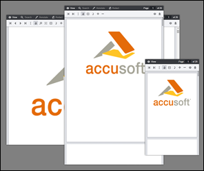
The Viewer interface was designed to adapt to any size viewport. Rather than targeting specific devices, the Viewer will fit to the maximum screen size on any device whether it is a desktop, tablet, or phone.

Media Queries
The Viewer uses CSS3 Media Queries (http://www.w3.org/TR/css3-mediaqueries/) with expressions using min-width and max-width to adjust the layout of navigation and dialogs.
Breakpoints
The Media Query Breakpoints, defined in viewer.css, are set according to the Viewer layout. On smaller viewports the tab navigation collapses into a menu and some tools are hidden. On larger viewports the dialogs transform from horizontal to a vertical layout to utilize screen real estate. The breakpoints are as follows:
Example
/* Target modern browsers that support media queries */
@media (min-width: 0) {}
/* Mobile & Tablet Sizes, collapse navigation tabs into menu */
@media (max-width: 767px) {}
/* Desktop Sizes */
@media (min-width: 768px) {}
Media Queries are not supported in Internet Explorer 8 and no Media Query polyfills are used in this regard. All Internet Explorer 8 specific styles are in legacy.css.
Changing the Breakpoint
To change the breakpoint from the default 768px you will need to change this in two places:
- In viewer.css, under the comment "viewport breakpoints", look for the following expressions:
Example
@media (max-width: 767px) {}
@media (min-width: 768px) {}
- In viewer.js look for the variable tabBreakPoint; this is used in viewer.js to collapse the tab navigation on smaller viewports:
Example
this.tabBreakPoint = 767;
Legacy Support
Media Queries are not supported in Internet Explorer 8 and no Media Query polyfills are used in this regard. All Internet Explorer 8 specific styles are in legacy.css. Since Media Queries are not supported, if you add styles within a Media Query block in viewer.css you will also need to add this to legacy.css.
Grid System
The Viewer uses a basic grid system to assist with the UI layout. Through a series of rows and columns the layout can scale dynamically. Rows are used to create horizontal groups of columns. Columns are created by defining the number of twelve columns you will span. For example, three columns would use three divs with a class of .pcc-col-4:
Example
<div class="pcc-row">
    <div class="pcc-col-4">Left</div>
    <div class="pcc-col-4">Center</div>
    <div class="pcc-col-4">Right</div>
</div>
.pcc-col-* classes are active in small viewports and .pcc-lg-col-* classes only take effect in larger viewports:
Example
<div class="pcc-row">
    <!--
    These two divs will span one column on small viewports but
    split to two columns on larger viewports
    -->
    <div class="pcc-col-12 pcc-lg-col-6">Left</div>
    <div class="pcc-col-12 pcc-lg-col-6">Center</div>
</div>
There are also .pcc-hide and .pcc-show classes which can be used to toggle content across breakpoints:
Example
<div class="pcc-row">
    <!-- This button will only appear on larger viewports -->
    <button class="pcc-hide pcc-show-lg">Left</button>
    <!-- This button will only appear on smaller viewports -->
    <button class="pcc-show pcc-hide-lg">Center</button>
</div>
Polyfills
There are a few polyfills used to provide support for browser features:
- HTML5 Shiv (https://github.com/aFarkas/html5shiv) - The HTML5 Shiv enables use of HTML5 sectioning elements in legacy Internet Explorer and provides basic HTML5 styling for Internet Explorer 6-9, Safari 4.x (and iPhone 3.x), and Firefox 3.x.
- Normalize (http://necolas.github.io/normalize.css/) - Normalize provides better cross-browser consistency in the default styling of HTML elements.
Components
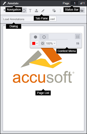
The Viewer is made up of a number of UI components:

- Tab Navigation - The set of tabs that distinguishes different aspects of the Viewer functionality.
- Tab Pane - The tools specific to each tabset. This can be configured to display horizontally or vertically.
- Status Bar - Displays the page number and allows you to jump to a specific page.
- Dialog - Menu area for extended options and settings.
- Context Menu - Menu that allows you to change properties of annotations.
- Page List - The viewer control that renders the document.
The styles for Tab Navigation, Tab Pane, Status Bar, Dialog, and Context Menu are defined in viewer.css. The styles for Page List are defined in viewercontrol.css.
Templates
You can change the markup of the Viewer UI components by editing the templates. The templates are HTML files ending in *.Template.html. The templates are consumed using the Underscore.js Template utility function. Variables and JavaScript conditions can be used within the templates using ERB syntax. For more information see the Underscore documentation at http://underscorejs.org/#template.
For a complete list of templates, refer to the HTML Templates topic.
Disabling Tabs
To disable one of the navigation tabs you could comment out the HTML in the templates or pass one of the following configuration parameters to the jQuery viewer plugin:
Example
var pluginOptions = {
    uiElements: {
        redactTab: false
    }
};
