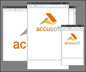

The Viewer interface was designed to adapt to any size viewport. Rather than targeting specific devices, the Viewer will fit to the maximum screen size on any device whether it is a desktop, tablet, or phone.

The Viewer utilizes CSS3 Media Queries (http://www.w3.org/TR/css3-mediaqueries/) with expressions using min-width and max-width to adjust the layout of navigation and dialogs.
The Media Query Breakpoints, defined in viewer.css, are set according to the Viewer layout. On smaller viewports the tab navigation collapses into a menu and some tools are hidden. On larger viewports the dialogs transform from horizontal to a vertical layout to utilize screen real estate. The breakpoints are as follows:
| Example |
Copy Code
|
|---|---|
/* Target modern browsers that support media queries */ @media (min-width: 0) {} /* Mobile & Tablet Sizes, collapse navigation tabs into menu */ @media (max-width: 767px) {} /* Desktop Sizes */ @media (min-width: 768px) {} |
|
To change the breakpoint from the default 768px you will need to change this in two places:
1. In viewer.css, under the comment "viewport breakpoints", look for the following expressions:
| Example |
Copy Code
|
|---|---|
@media (max-width: 767px) {}
@media (min-width: 768px) {}
|
|
2. In viewer.js look for the variable tabBreakPoint; this is used in viewer.js to collapse the tab navigation on smaller viewports:
| Example |
Copy Code
|
|---|---|
this.tabBreakPoint = 767;
|
|
The Viewer uses a basic grid system to assist with the UI layout. Through a series of rows and columns the layout can scale dynamically. Rows are used to create horizontal groups of columns. Columns are created by defining the number of twelve columns you will span. For example, three columns would use three divs with a class of .pcc-col-4:
| Example |
Copy Code
|
|---|---|
<div class="pcc-row"> <div class="pcc-col-4">Left</div> <div class="pcc-col-4">Center</div> <div class="pcc-col-4">Right</div> </div> |
|
.pcc-col-* classes are active in small viewports and .pcc-lg-col-* classes only take effect in larger viewports:
| Example |
Copy Code
|
|---|---|
<div class="pcc-row"> <!-- These two divs will span one column on small viewports but split to two columns on larger viewports --> <div class="pcc-col-12 pcc-lg-col-6">Left</div> <div class="pcc-col-12 pcc-lg-col-6">Center</div> </div> |
|
There are also .pcc-hide and .pcc-show classes which can be used to toggle content across breakpoints:
| Example |
Copy Code
|
|---|---|
<div class="pcc-row"> <!-- This button will only appear on larger viewports --> <button class="pcc-hide pcc-show-lg">Left</button> <!-- This button will only appear on smaller viewports --> <button class="pcc-show pcc-hide-lg">Center</button> </div> |
|