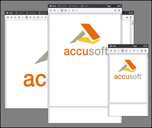

The Viewer interface was designed to adapt to any size viewport. Rather than targeting specific devices, the Viewer will fit to the maximum screen size on any device whether it is a desktop, tablet, or phone:

The Viewer utilizes CSS3 Media Queries (http://www.w3.org/TR/css3-mediaqueries/) with expressions using min-width and max-width to adjust the layout of navigation and dialogs.
The Media Query Breakpoints, defined in viewer.css, are set according to the Viewer layout. On smaller viewports the tab navigation collapses into a menu and some tools are hidden. On larger viewports the dialogs transform from horizontal to a vertical layout to utilize screen real estate. The breakpoints are as follows:
| Example |
Copy Code
|
|---|---|
/* Target modern browsers that support media queries */ @media (min-width: 0) {} /* Mobile & Tablet Sizes, collapse navigation tabs into menu */ @media (max-width: 767px) {} /* Desktop Sizes */ @media (min-width: 768px) {} |
|
There are a few polyfills used to provide support for modern browser features:
The Viewer is made up of a number of UI components:

The styles for these components are in viewer.css with exception to Page List, those styles are defined in viewercontrol.css.
You can change the markup of the Viewer UI components by editing the templates. The templates are HTML files ending in *.Template.html. The templates are consumed using the Underscore.js Template utility function. Variables and JavaScript conditions can be used within the templates using ERB syntax. For more information see the Underscore documentation at http://underscorejs.org/#template.
For a complete list of templates, refer to the HTML Templates topic.
To disable one of the navigation tabs you could comment out the HTML in the templates or pass one of the following configuration parameters to the jQuery viewer plugin:
| Example |
Copy Code
|
|---|---|
var pluginOptions = { uiElements: { redactTab: false } }; |
|